David Waterfield, Director for AlixPartners’ Investigations Disputes and Risk Practice, along with Mark Doughty, Senior Vice President with AlixPartners’ Litigation Data Analytics Practice, discuss how data visualization and analysis are helping lawyers see their cases in a new way, literally.
CCBJ: What exactly is data visualization, and why should we care about it?
David Waterfield: At its heart, data visualization is the process of presenting complex data in such a way that meaningful conclusions can be drawn from it. While an Excel bar chart or scatterplot can provide certain insights, the data sets we encounter today are much larger and more complex than they used to be. They are, in fact, multidimensional and new appraoches are needed to help analyze this data so that meaningful conclusions can be drawn from it. On complex matters, not all data sets will tell exactly the same story, or support the same arguments, and in some cases different data sets may contradict one another. Data visualization tools easily handle large data sets and create dashboards that show different data sets alongside each other, in an easily digestible format.
Mark Doughty: The investigations and disputes matters that we work on often require us to conduct historical fact-finding, oftentimes looking at multiyear, international events with multiple players involved. A human brain struggles to remember all of this information, and connecting the dots gets even more complicated. These issues are further magnified when various team members are conducting the investigation, especially in situations where the insights will only be apparent once all of the facts are put together and made available to the entire team to discuss and debate. A single data visualization tool pulls all the facts together to create a common view. This is transformative in terms of understanding the case history and where a particular item does or doesn’t support the current accepted narrative of the case, which may have been drawn from people’s recollections of historical events.
What sorts of data go into a typical dashboard?
Doughty: Typically, the best candidates for these dashboards are data that are structured in a tabulated format, as the real power of the tool is in being able to filter the underlying records across particular dimensions – such as dates, specific people, geographic locations, business units, or really any feature you can think of. This data will normally come from the client’s databases, such as their financial systems or enterprise resource planning systems.
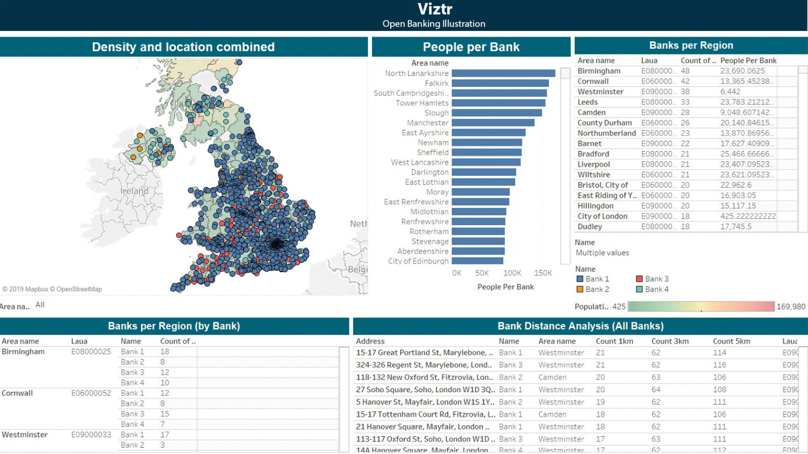
For example, the data sets we’ve analyzed have included purchases, sales, quotes, product pricing, commodities trades, market benchmarks, Wi-Fi hotspot data, and even data from sensors indicating a person’s physical location. Put simply, if the data is in a database, and it’s of interest to the case, then it’s a candidate to be visualized. (See images)
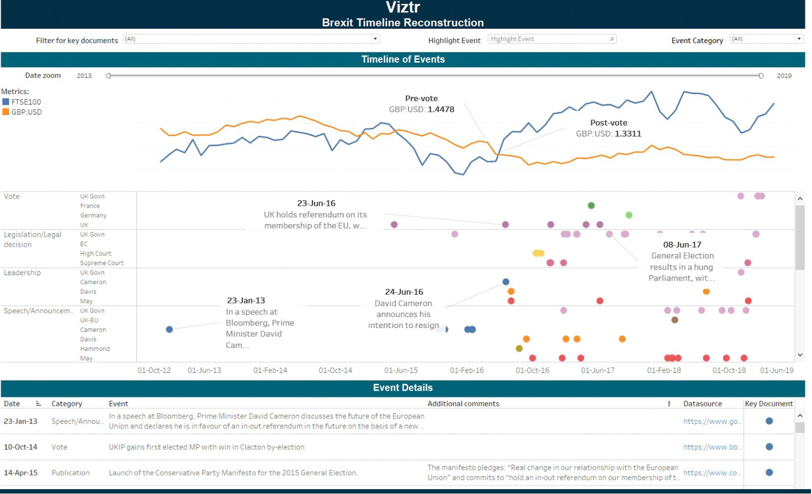
Waterfield: We’ve also taken less structured data, such as emails and documents, and produced visualizations on these. Typically, with this we’re visualizing the metadata associated with the documents, such as the date or senders and recipients of emails, which we can plot on a time line. Equally, if the documents have been tagged in a document review platform, we can use these tags as dimensions that can be filtered in the dashboard. Another source is time lines that have been obtained through interviews with people involved in the matter. This is especially important as when you put a human’s recollection of events alongside the contemporaneous digital footprint of that event. It’s not unusual to see differences, especially when the events took place several years ago. Understanding where human recollections and the digital footprint diverge can be a useful proofing point.
Is this new technology?
Doughty: Not really. Data visualization tools like Tableau and QlikView have been around for more than 10 years, and there are many players in the analytics and business intelligence market. The more established players like Microsoft, SAP and IBM continue to develop and expand their offerings, and the less well-known niche vendors continue to innovate. The tools enable users to quickly interact with and interrogate their data without the extensive involvement of an IT department. Despite these tools no longer being novel, we exploit the speed of visualization development and agility of these tools in our urgent, time-critical projects and see real value in how these tools are applied, rather than what tool is used. The ever-increasing scalability of these tools also means that large data volumes are no longer a limitation, which is great for us, as it’s not unusual to be handling hundreds of millions of records on a matter.
The ever-increasing scalability of these tools means that large data volumes are no longer a limitation.
— MARK DOUGHTY
Waterfield: On the whole, I think these tools have historically focused on the revenue and growth aspects of the business, such as sales, customer research and marketing, where people wanted new ways to understand performance and areas for growth and expansion. Their widespread use in the world of investigations and disputes is relatively new, and indeed is still maturing. But, as an indication of their growth, of the last five cases I’ve worked on, four have had significant data visualization workstreams. The response from the end client, lawyers and barristers, has typically been that the visualization has really transformed their understanding of the case.
So, we just plug in the data visualization tool and we can start analyzing the data?
Doughty: We’re not quite there yet. A lot of the hard work happens behind the scenes; extracting the data from the databases that underpin operational and financial systems, the unenviable task of cleansing the data, and then the (fun) challenge of linking it together with other data sets to provide further context or an end-to-end view of events. Once you have that foundation of clean and well-understood data, you can then create subsets of data to feed into the data visualization tool.
Waterfield: At that point, you get into a really interesting phase of building prototype dashboards, sharing them with the legal team and end client, getting feedback, and then refining the dashboards. In some cases, the information that needs to be shown is quite intuitive, but in others it is quite iterative, especially in the early days of a case when the team is still feeling its way around the issues.
How do lawyers respond to and actually use data visualizations on cases?
Doughty: If you get the design right, the dashboards should be very intuitive, with different controls at your fingertips that allow you to apply filters, switch between views, and zoom in and out quickly. Looking back, our first dashboards looked like a collection of charts in Excel, but over time we’ve learned to really understand how to get the best out of the tools.
Waterfield: Some lawyers engage with the tools and want to take them away and use them themselves, whereas others see the most value in having them up on a big screen during meetings, so that the team can discuss the findings together. Personally, I think both approaches work, but the best use I’ve seen is when you have the lawyers, testifying experts, and data analytics team all around a table debating the case, using dashboards as an anchor for the conversation. A picture can tell a thousand words, and it certainly also prevents unnecessary arguments about the facts and chronology of the case.
What are the real benefits to the client’s in-house counsel and external counsel?
Waterfield: Historically, we built the “foundation” data set, but at that point the only people that really understood the data were those on our data analytics team. We would get specific questions from the lawyers and would use the data to respond, but the process wasn’t dynamic, and the closed nature of the questions meant that the lawyers were not really exploring the available data and participating in joining the dots.
Doughty: On one of our first cases where we used data visualization, there were three law firms involved, all with different areas of focus. We ended up producing a PowerPoint presentation that was over 90 slides long, all with slightly different cuts of graphs, and it started getting unmanageable. We very quickly realized that data visualization was the solution. We rebuilt the graphs in our data visualization tool and included all of the filters that were required to generate the slides. The legal team could then log in to a secure website whenever they wanted and run their own analysis on the dashboards. The feedback from the lawyers was fantastic, as for the first time they really got to play with the data and get immediate feedback from question to answer.
When you put a human’s recollection alongside a contemporaneous digital footprint, it’s not unusual to see differences.
— DAVID WATERFIELD
Are there any pitfalls in using this kind of approach?
Doughty: Any tool will have natural limitations to its functionality, so it’s important to understand that up front. But even when we’ve found that the functionality is not there, we’ve been able to find workarounds.
Waterfield: It’s important to get everyone to buy in to the fact that the tool will only be as good as the data that you feed into it. If the lawyers are going to provide a curated set of emails or key events, they need to be committed to the process and maintain it as the case develops.
Doughty: As obvious as it sounds, you also need a single person to “own” the dashboard and be responsible for ensuring that new updates are properly tested. It’s too easy for people to abandon a tool after one bad user experience, so maintaining the buy-in and trust in the solution by keeping it working properly is very important.
What’s your favorite functionality?
Waterfield: For me it’s the geospatial functionality. This feature allows you to show a map of a location and plot events onto it using x-y coordinates. You can then apply a time series to it and show how physical events played out over time. The use cases are relatively rare for this functionality, but we’ve had one case where it was a real game-changer in terms of furthering the understanding of the case.
Doughty: Yes, that case was fascinating. To risk using a buzzword, the internet of things will mean that devices everywhere will have sensors that are collecting data all of the time. If you can (legally) extract this data and visualize it, it can provide a wealth of insights into the movements and behaviors of key people or objects of interest. It is a bit of a scary Big Brother thought though.
What, in your view, are the next developments in this area?
Waterfield: I think more widespread use in investigations and disputes is the next development. There’s not a case we work on now where we don’t at least ask ourselves whether data visualization can bring value and insight to the case. Eventually, I think we’ll see a shift from this being an internal tool to one that’s used to tell a compelling story to regulators or to the courts. Most of the cases we work on are incredibly complex, so distilling the key messages and telling a story about how things evolved over time is very challenging. Data visualization offers a different way to communicate it.
Doughty: I think another area will be the increased use of this technology in proactive compliance monitoring with companies. Most compliance functions still rely on multiple different monitoring systems and controls to cover all of their key risk areas. Using data visualization to bring these data sets together in a single visual dashboard could really help compliance get a more holistic and macro-level picture of the business risks, with the ability to drill down into specifics.
Published December 23, 2019.